These images show the pictures from my original photo shoot. The first 5 images show the worst quality images, and the pictures where the model is not presented in the perfect manor.
Bad Quality Images
I will not be using this image as the model isn't looking at the camera, and her facial expression is not appropriate for my magazine.
I wouldn't use this picture as the model is looking forwards and you can't see her face so the audience wouldn't be able to engage with her.
This picture is unusable as the models hair isn't appropriate for the genre of my magazine as it is standing up, and her facial expression is in a rather 'jokey' expression and also isn't appropriate for my genre.
This picture also isn't suitable as the picture is more pixelated than others, and also her facial expression looks very strained and uncomfortable so the audience would feel uncomfortable looking at it.
This image is not suitable for my magazine, as the models hair isn't done nicely, and the model isn't paying attention to the camera so she doesn't know she has been photographed.
Good Quality Images
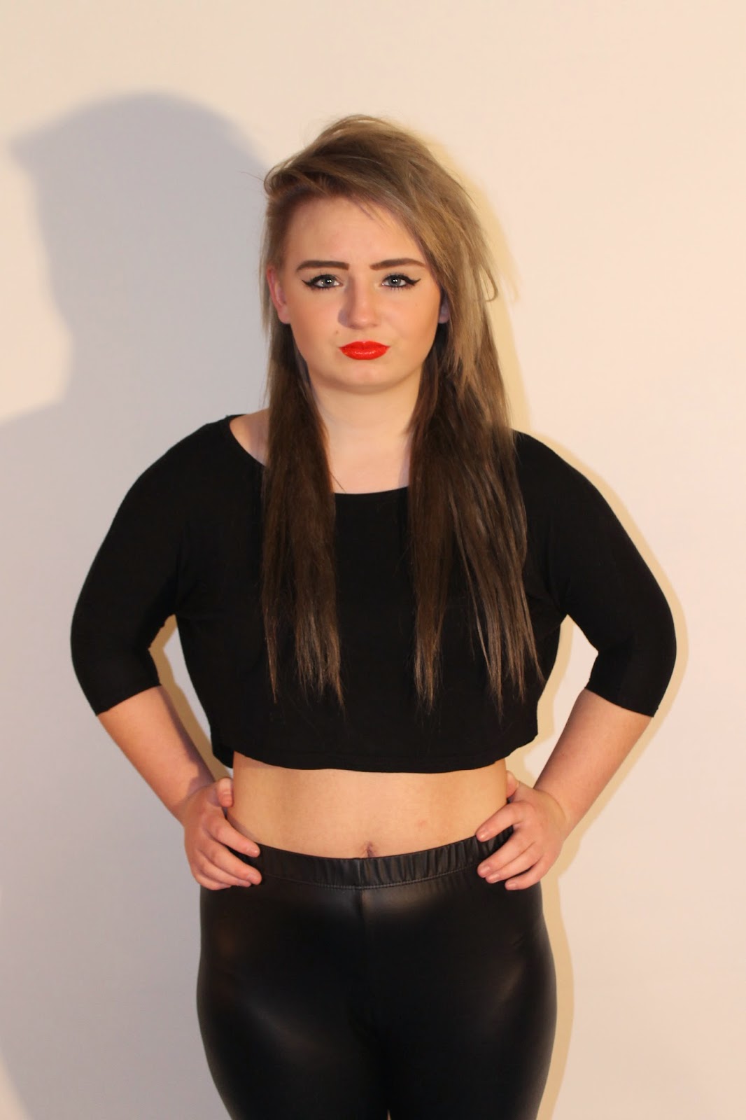
This image would work well for my magazine, because she is directly looking at the camera, which makes her engage with the audience. This picture is also a mid-shot image which would work well for the front image photo.
This picture would also work well for my magazine as the model is facing forward, directly addressing the audience. The model also has a very stern facial expression, which shows that she is in control; I feel my target audience would connect with this.
This image would well for my magazine; however it would not work well for the main cover picture as it isn't a mid-shot and she's not facing directly towards the audience, which means the audience wouldn't connect with her, and feel more drawn to buy the magazine. However this image would be good for contents page or double page spread because of how the model is looking up, supposing that she is thinking about or looking at something that intrigues her; this will make the audience wonder what this is and will want to read more to find out.
I feel this image would also work well for my magazine, as her style of clothing fit the genre (Indie/Rock) and the attitude the model is putting across, is rather dominate and in control of the situation. Also the red lipstick stands out more in this image, and represents either love or danger; the reader will want to know what her story is from looking at this image.
I like this image, because of the models pose and body position in this image; I feel this image would work well with the contents page or double page spread. I like how the model is looking up, with a slit pout on her lip; I feel because this image is taken from the side all of the models features are clear and body is more defined.
This image comes across a lot more innocent than the other images, showing more of her sweet and innocent side. I feel this image would work well for the double page spread as when the audience are reading all about her they would understand the image more and see that she truly does have a more innocent side, that she doesn't put across. I also like the lighting in this image, as its bright and shows all her features; the lighting being so bright also helps present her more innocent side.


No comments:
Post a Comment