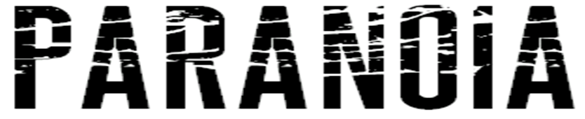
This font will work well for my magazine, it fits in with my genre well and stands out. It would catch the readers attention and draw them into the magazine. This font is easy to read, bold and different. Where the font is bold and large it will attract the readers attention, but because it has the white lines throughout the words it gives it that different affect which makes it fit in with the rock theme.
I'm not sure about this font I don't think it stands out well compared to the other fonts. Also I don't like how around the text it has a white border, I don't think that would fit in with my theme well.

I like this style, it suits my theme, however I don't think it would work well for a magazine because of the black sprayed paint around the text. It would be different to incorporate it into a magazine without things getting hidden by the black sprayed paint or other things covering it.

I like this font because it fits in with the rock theme well, its bold so it would attract the readers attention. I also like this font because it has a different style, its got an edge that gives off a rock theme.
No comments:
Post a Comment