Friday 28 March 2014

Magazine Publisher

Looking at what type of publishers would publish my magazine, I needed to look into what publishers publish magazine that are the same genre as mine, or a similar genre.


Bauer Media Group is a multinational media company based in Hamburg, Germany. It operates in 16 countries worldwide, since it was founded in 1875. It has been a privately owned and under management by the Bauer family since it was founded. It was originally named Heinrich Bauer Verlag KG, which was abbreviated to HBV and was usually shortened to H. Bauer. Bauer Media Group publish 300 magazines worldwide, as well as TV and Radio stations. Bauer started publishing magazines in the UK with Bella Magazine in 1987, and became Britain's third largest publisher. 
The Bauer Media Group would be a good publisher to use as the publication for my magazine as they publish Q Magazine; Q Magazine is the same genre of music as my magazine I have chosen. As this publication doesn't just focus on music and magazines, they have a variety of different skills to gain consumers. 


New Flat Plan

This is the flat plan I have re-designed for my music magazine remake. I have included more information about what will be on what page and what each article will be about. I have also shown where different adverts will be, and I have included more information on concert and gigs; as my target audience will enjoy more information about these things. I have kept it very similar to the original flat plan I designed, as I felt there wasn't much to change; but I made the alterations needed to make the flat plan fit my new music magazine.


Old Flat Plan

This is the flat plan I created for my original; I have decided to follow the layout of this flat plan, however I will make a variation of different alterations, to what content will be included in the flat plan.  


Magazine Masthead Font Ideas

I decided to start researching different font designs for my magazine. I used the website 'FontSpace' as they have a large variety of different font styles, designs and allows me the ability to change the colour of the font and background. I decided to change my masthead name as the previous name I had 'PARANOIA' suited the rock genre more than my new genre Indie/Rock. So I've changed the name to 'INK' as this represents my chosen genre more and my target audience after receiving my feedback from the questionnaires also decided 'INK' was the best name.

I decided that a bold font would work best with my magazine, as it would grab the readers attention, and would be noticeable, and easy to spot on a shelf full of other magazines. I also think a bold font will work better with my chosen genre, as its bold and captivating.

'Gist Rough Upr Exboid Two Demo'
I like how this font is different because of the faded black and white tones on the letters and the white line that runs through the middle of the letters. However I feel this font wouldn't work for my chosen genre, and I don't feel it is bold enough to grab my target audiences attention. 

'High School USA'
This is my favourite font out of the three I have chosen; I feel this one is bold enough to grab my target audiences attention, and to stand out compared to other magazines. I also feel that this font fits with my chosen genre, its bold and easy to read. Where the font is bold and large it will attract the readers attention. This will be my masthead font; as I feel it works best for my magazine and the chosen genre. 

'American Captain'
I like this font because of how bold and captivating it is, but I feel it doesn't stand out enough. The text is slightly pixelated and the letters seem very pain. 


Wednesday 26 March 2014

Magazine Front Cover Draft

This is my magazine front cover draft; I have added all of the main conventions of a magazine front cover, to make sure mine is as realistic as possible. My draft might change, or I might add more conventions in to fill in blank spaces; this will be to make sure it is appropriate for my target audience. I wanted to make my magazine layout a lot similar to NME, CLASH and DAZED AND CONFUSED; this would allow my magazine to be easy to read, and will attract my target audience.


Tuesday 25 March 2014

Photo Shoot Images

These images show the pictures from my original photo shoot. The first 5 images show the worst quality images, and the pictures where the model is not presented in the perfect manor.

Bad Quality Images

I will not be using this image as the model isn't looking at the camera, and her facial expression is not appropriate for my magazine.

I wouldn't use this picture as the model is looking forwards and you can't see her face so the audience wouldn't be able to engage with her.

This picture is unusable as the models hair isn't appropriate for the genre of my magazine as it is standing up, and her facial expression is in a rather 'jokey' expression and also isn't appropriate for my genre.

This picture also isn't suitable as the picture is more pixelated than others, and also her facial expression looks very strained and uncomfortable so the audience would feel uncomfortable looking at it.

This image is not suitable for my magazine, as the models hair isn't done nicely, and the model isn't paying attention to the camera so she doesn't know she has been photographed.


Good Quality Images


This image would work well for my magazine, because she is directly looking at the camera, which makes her engage with the audience. This picture is also a mid-shot image which would work well for the front image photo.


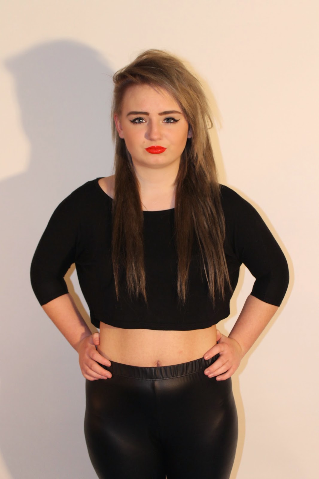
This picture would also work well for my magazine as the model is facing forward, directly addressing the audience. The model also has a very stern facial expression, which shows that she is in control; I feel my target audience would connect with this.


This image would well for my magazine; however it would not work well for the main cover picture as it isn't a mid-shot and she's not facing directly towards the audience, which means the audience wouldn't connect with her, and feel more drawn to buy the magazine. However this image would be good for contents page or double page spread because of how the model is looking up, supposing that she is thinking about or looking at something that intrigues her; this will make the audience wonder what this is and will want to read more to find out.


I feel this image would also work well for my magazine, as her style of clothing fit the genre (Indie/Rock) and the attitude the model is putting across, is rather dominate and in control of the situation. Also the red lipstick stands out more in this image, and represents either love or danger; the reader will want to know what her story is from looking at this image.


I like this image, because of the models pose and body position in this image; I feel this image would work well with the contents page or double page spread. I like how the model is looking up, with a slit pout on her lip; I feel because this image is taken from the side all of the models features are clear and body is more defined.


This image comes across a lot more innocent than the other images, showing more of her sweet and innocent side. I feel this image would work well for the double page spread as when the audience are reading all about her they would understand the image more and see that she truly does have a more innocent side, that she doesn't put across. I also like the lighting in this image, as its bright and shows all her features; the lighting being so bright also helps present her more innocent side.


Photo Shoot

For my main artist images I will be re-using my original photo shoot as I think the images were good quality, they also think in with the genre I have chosen and suits my target audience. My model fits in with my genre as she is pretty, fiesty and reflects my female target audience; aslo as she is an attractive female she will suit my male target audience. Although I will not be using the same images as they wouldn't reflect my new genre (Indie/Rock) as well as the other image I took of my model.

Questionnaire Results

These are the results I had from handing out 20 of my questionnaire's to my target audience; I have put all of my results into pie charts, so it is presented in a better format and is easier to read and understand.

From handing out my questionnaire's to my target audience the highest choice of name was 'INK' from the other names. Although 'INSANIAH' was the second most popular choice with 'KLAMP' being the least popular.

After gathering my results from the questionnaires I handed out my target audience feel the best colour scheme suited for my genre of magazine is Black, White and Red. I feel this will work well with my chosen genre (Indie/Rock).

Out of the five choices I gave my tagret audiences for what kind of articles would they expect to see exclusive interviews was the most common answer, with concert and gig upcoming events and music charts coming close behind. I will make sure to include the top three in my magazine, but also using the other 2 as these were also choices of my target audience just not the most popular.

From my results I gathered people would rather that this magazine was to be realised monthly than weekly or every fortnight.

My target audience weren't willing to pay more than £2.00 for the magazine, so I will make sure the price of my magazine is only £2.00, so I keep my target audience happy with the price.

My target audience felt that if I provided a free gift with my magazine they would be more inclinded to purchase the magazine; rather than if no free gift was included. So whilst designing my magazine I will make sure that a free gift will be clearly presented on my front cover, so my target audience know that a free gift is included.

From gathering my results from my target audience who would like to recive a free gift with my magazine I noticed the most common free gift choice was a guitar pick, with a poster coming second and the CD containing a new realise being the least popular. I feel the reason the CD was the least popular is because most people access their music online, and don't use CD's as much anymore. I will make sure that a free guitar pick is included and advertised on my magazine, I will also include a poster in my magazine to please a larger variety of my target audience who wanted a free poster to be included.

Mainly my target audience read music magazines weekly and monthly, but a small number of them never read them or read them daily.

Tuesday 18 March 2014

Questionnaire

This is my questionnaire from the first magazine I created. Although I have changed the genre of my magazine, and some of the question were irrelevant, I have used this questionnaire as a guid line. In my new questionnaire I have used some of the same questions as the old one, however the new one reflects more on the Indie/Rock genre and my target audience.


This is a new magazine questionnaire, as you can see I've made changes to the old one to make sure it was more appropiate for my new genre theme; which is Indie/Rock.

Monday 17 March 2014

Target Audience MoodBoard

This mood board visually represents my target audience. The mood board shows the music, magazine, clothes, and a variety of different things my audience enjoy. It shows that my audience enjoy listening to Indie/Rock music and enjoy reading Indie/Rock magazines, take music seriously and enjoy going to different concerts/gigs/festivals. My target audience is female to male based around 16-30+, however people older still enjoy this genre of music, so I will make sure to make my magazine suitable for these ages.


MoodBoard

This was my mood board from my original magazine. This mood board was good as it included different Rock magazines, different bands and artists that fit the rock genre. However it wouldn't completely work for the Indie/Rock theme I want to use for my re-submission magazine, as it doesn't include enough Indie features and items that would be seen as 'Indie/Rock'.

This is my new mood board representing the Inide/Rock theme. I've included images that show different magazine titles and bands that fit the Indie/Rock theme.

Magazine Ethos

The ethos that I have decided to use for my magazine is to present the magazine love for music, and show how serious they are towards music, whilst showing the fun side as well. To appeal to my target audience and to fit the genre Indie/Rock I will include upcoming concerts, gigs and festivals. I will also include interviews, top charts, gig guides, new upcoming bands, and much more to attract my target audience. I will make sure that not only is my magazine visually attracting by using a variety of images, but I will also include text to suitable for my target audience who prefer to read more about the information, rather than look at lots of images that don't explain the story. I plan to make my magazine suitable for a variety of different ages, and for both genders; I will do this by using articles, interviews, images, and more that will appeal to both genders and all ages.
The language used to fill my magazine will be English in its most known form, as my magazine will be read by a variety of different ages. So it isn't appropriate for me to include 'slang', and words/phrases that are more commonly known to one generation. I will make sure the text is diverse in the fact that it suits all ages, and can be read and understood by both genders and from ages 16+. I won't include swearing in my magazine, as even though swearing isn't seen as such of offense anymore, I wouldn't want to upset any of my readers; so I will keep the language friendly and suitable for all.

Double Page Spread Anaylsis

I decided to analyse different double page spreads of my chosen genre, to understand what to include, to get some ideas of how I can make my double page spread as realistic as possible and to make sure it matched my chosen genre.

NME Double Page Spread
The main image shows the band 'The Teenagers' in a very relaxed, simple pose with a messy background that represents a bedroom; the image takes up most of the page, so the audience know who the article is about. The masthead is the name of the band, this lets the readers know this is the main article, its about that specific band and attracts fans/readers of the band into reading the article. The double page spread includes a 'Need to Know' box including features about the band; this is an effective way to give the reader information about the artist they are reading about. The style of the double page spread is rather crowded compared to other double page spreads; although it is still a simplistic layout, but has been designed to look busy and interesting. By using the blocks of colours it grabs the readers attention to that part of the page; for example the blue background/blocks is used for important parts of the text, to allow it to stand out compared to the rest of the text. 

Q Double Page Spread
The double page spread features a picture of Lady Gaga dominating the whole left page; this stands out letting the audience identify who the article is about. It is an eye catching and effective way to attract the reader into the page, to read more. The colour scheme: red, black and white, gives modern sleek affect. By putting the large 'L' in red and in the center of the page it attracts the audience towards to, so they can read on about the artist. This double page spread breaks the conventions of a typical contentions page, they've done this by not pulling quotes out from the article. Also the only masthead featured on the spread just says, 'lady GAGA', this is effective because it shows that just by the audience reading her name, it will persuade them to read the article. The double page spread appears very modern and professional, because of the neat layout, this will attract the reader and persuade them to read the article. It will also be easier for the reader to read the article, as because it is presented neatly it will be easier to know what to read when, and where to read. 

CLASH Double Page Spread
The main image and only image for this article is dominating the left page, and is what the audience immediately see when they look at this page. By shinning the light above the artist they have created this feeling of sadness on the image or are suggesting a darker side to the artist; this will make the audience more intrigued into reading the article. The overall layout of this page is very conventional with the main image dominating the whole side of one page, with the main article on the other side. The text on the right sided page isn't like a conventional double page spread, as there are blank spaces, the mastheads are in a small font, and the main article text is in a very small font pushed to the bottom of the page. There is also a large variety of different texts used on page; this has been done to allow certain texts and mastheads to stand out more than others, to grab the audiences attention. The style and layout of this double page spread is very sleek and modern, this makes it easier for the audience to read. 

Contents Page Analysis

I have decided to look into different contents pages of my chosen genre, to get an idea of what to include, how to lay it out and design ideas. I also wanted to look into contents pages to see the different conventions they use, and what made each magazines contents page different.


NME Magazine Contents Page
The title of the magazine 'NME' has been included on the contents page to remind the reader of the magazine name. Also next to the 'NME' text it says 'This Week' to show the reader that it is this weeks issue, with underneath the date so you know what month and week issue it is. The magazine has included a 'Band Index' this allows the reader to see all the bands that have been mentioned throughout the magazine and on what page, so if they wish to read about a certain band they can find it easily. The fact the bands names are also printed in red makes the text stand out and also link in with the masthead 'NME' as that text is also red. The main image is of the band the 'Kasabian'; the image appears to be taken whilst they were performing instead of done in a studio. The sell lines have been categorised into different sections, such as news, radar, reviews, live and features; this has been done to allow the reader to find the certain articles they want faster. They have used coloured text for the page numbers, so it is clear to the reader what page each articles are on. Advertising has been placed at the bottom of the page, this appeals to the audience as it allows them to be able to purchase the magazines. 

Dazed and Confused Magazine Contents Page
This contents page has been designed in a very simple manor, including only one main image, of three blurred out faces, with the text running down the left side and the title of the magazine included at the top in a very small font. The colour scheme has been kept very simple only using black, white and grey; this presents a very dull appearance which attracts the audiences attention equally to the image and the text on the page. The text has been categorised into specific sections so it is easier for the target audience to find the articles they want to read quickly and efficiently.  Because of the simplicity of the layout and the colour scheme of this page it creates a modern, sleek, neat appearance; which will attract their target audience as it will be easier for them to read. 

Q Magazine Contents Page
This contents page has been kept quite simplistic including only two images; this makes the page less crowded and easier for the audience to read. The contents includes the features that are throughout the magazine, the articles have been given titles, and a description of what is included in each article; this will help the reader know and decide what articles to read. At the bottom of the page they've included 'Q Review', this will catch the audiences attention as it's a catchy name for the section. Also as its a review of the magazine the audience will want to read it to see what the newest releases and articles are like/about. The main image has taken up most of the page so this catches the audiences attention; at the bottom of the image it includes the anchorage text telling the reader what the image is about and what page to find that article.

Chosen Genre

The Genre I have chosen for my re-submission is Indie/Rock, this is similar to my first magazine submission, however I have decided to add an Indie influence into my magazine, as this will add an extra twist on the rock theme I did with my last magazine. I decided to keep to the whole rock theme as I have already done work on it before, so I know certain criteria's that need to be added; also as I have already done this theme I know where I originally went wrong, so I can add and change the things that I've already done incorrectly. This will allow me to improve my work to make it fit my genre more, and suit my target audience more.

I want to follow the style of NME magazine, CLASH, DAZED and CONFUSED and a lot of my inspiration for design techniques, articles and colour schemes will be taken from these magazines.


Research into Non Music Magazines

I've looked into different types of magazines to show how a variety of different magazines all have the same conventions of music magazines. I want to look at how the conventions of magazines add to different guidlines and how they change because of different genres. I'm also considering how different images, colour schemes and mastheads change the appearance and genre of magazines.

 
Heat is a British entertainment gossip magazine, published by a German company Bauer Media Group. In 2004 it was the biggest selling magazines in the UK. It includes celebrity news, gossip, movie reviews, music reviews, TV listings, beauty advice and fashion. It's mainly aged at women aged 18 and above; although it is not mainly a women's magazine. Just like a music magazine the magazine has been included in the top left corner in a bold font to stand out and to grab the audiences attention. The slogan of the magazine 'This weeks hottest celebrity news'  has been included on top of the masthead; most music magazines place the slogan underneath the mast head, but sometimes they places them on top of the magazine or in the skyline. This magazine included more pictures than a music magazine, so it appears to be 'messy' unlike music magazines; however they do included the conventional main image in the center of the page with anchorage text to tell the audience what the image is about. Also on each image they have added anchorage text so they audience know what each article inside the magazine will be about.  Unlike a music magazine, which has a specific colour scheme, this magazine doesn't appear to have a set colour scheme, as there is a large variety of different colours. However they have used read as the masthead main colour to attract the audience, and a bright yellow to also attract the audience. Like a music magazine the bar code has been placed at the bottom of the magazine, in a horizontal style; however the bar code has been placed on the left side where music magazines usually place them on the right hand side. 

Nuts is a weekly lad mag, published in the UK, including provocative pictures of females, gadget information, cars and sports. It used to be sold every Thursday but has been moved to every Tuesday instead; their marketing campaign slogan is ''When You Really Need Something Funny''.  The masthead has been placed at the top left corner of the page like a music magazine; as the magazine is called 'Nuts' it suggests that this magazine is designed specifically for the male audience, as 'nuts' refers to the male genitalia. Also as the mast head is in a bold red font this connotes a sense of seductiveness which appeals to the male audience. The main image of Lucy Collett, is a seductive image with the model looking directly at the audience to engage with them; this image represents the theory of the male gaze. Just like a music magazine the main image has taken up most of the page, whilst being centered in the middle, it also has anchorage text on the side to show the readers what the image is about. As the main anchorage text says '140 sexiest Twitter pics!' this will appeal to the male audience, as they will want to see all the revealing images. The price of the magazine has been placed on top of the masthead in a small font, so it's not very visible so the audience want to buy the magazine before they know the price of it; unlike a music magazine that places the price in one of the bottom corners next to the bar code.  The bar code has been placed in the bottom right corner, this follows the conventions of a music magazine as they are also placed in the bottom right corner, on its side.