
Wednesday, 23 April 2014
Contents Page Re-Evaluation
After re-evaluating my final posts on my blog, and looking at my final media products again; I noticed how I didn't include enough images throughout my media products. Therefor I have gone back to my contents page and have added another image. I've done this to make sure enough images are included throughout my products and so my target audience enjoy my final outcome more.

Thursday, 10 April 2014
Wednesday, 9 April 2014
Final Double Page Spread

This is my final outcome of my Double Page Spread. I am happy with the outcome of these pages as are my target audience. I feel that because I have gone for the minimalistic but affective style/layout it draws the reader in more than a busy page. It also allows the reader to read the text easily, and gain more information about the article itself. I have continued on with the same colour scheme and design style/layout, this shows continuity throught my work; and will draw my target audience towards my magazine more.
Final Contents Page

This is the final outcome of my contents page; I like how it continues on from my front page with the same colour scheme and design of layout. This page also clearly presents my chosen genre, and represents my target audience with the type of articles they would like to read.
Final Front Cover

This is the final product of my magazine front cover. I am happy with the result of my product and my target audience are happy with the outcome as well. I like how the front cover presents the Indie/Rock theme that I was trying to represent. It's a bold, eye catching and easy to read layout; with the overall feel of a professional, sleek, modern, clean and minimalistic look. As I have layed out it in this way with my chosen genre presented clearly my target audience will be drawn to read it.
Audience Feedback Changes on Contents Page

Due to the positive feedback on my contents page from my audience feedback I haven't made any changes to the outcome of it. I have however gone through and changed spelling and grammatical errors to the text through out the page.
Audience Feedback Changes on Double Page Spread
After reading all the comments, and suggestions I got from my audience feedback I have gone back and edited certain features of my double page spread.

Firstly I went through all the text and fixed all the grammatical errors and spelling mistakes, that were pointed out in my feedback. I then decided to change the colour of the word 'TAKEOVER' from yellow to black. Afterwards I felt that it seemed to plain and it needed something extra, so I added drop shadows to the text. I added the drop shadow effect to the text 'MUSIC TAKEOVER' and the pull quote next to the main image.
Audience Feedback Changes on Front Cover

After reading my audience feedback, they said that they could read the yellow text very well. Due to them not being able to read the text I have added the drop shadow affect on the yellow text sell lines. My audience also noticed a few spelling and grammatical errors, so I have gone through all the text and changed all the mistakes.

This shows the results of the drop text on the yellow text sell lines. I feel the drop shadow not only allows the audience to read the yellow writing better but gives an extra affect, that sells my magazine by appealing to my target audience and chosen genre.
Monday, 7 April 2014
Audience Feedback
I decided to post my magazine pages onto Facebook to gather audience feedback. I felt this was a good way to gather feedback, as I can get a large variety of peoples opinion on how to improve my magazine.


Firstly I created a new album on Facebook to add my images to, I also added a comment to let people know what the images are and what, and if they would leave some feedback.
The first audience feedback I got Michelle pointed out a spelling/gramatical error I had made. However she did state that other than that she loved all the pages I had created.
This was all the feedback I received on my post. Overall all of my feedback was positive, which is good because it means it appeals to my target audience. The main comments I had to change on my pages was the yellow font wasn't easy to read and I made some spelling/grammatical mistakes. I will take into consideration all the comments I have received whilst re-editing my magazine pages to make them more appealing to my target audience.
Construction of Double Page Spread

Firstly I started by selecting a image to use for my double page spread. I then went onto the online picture editing website 'PicMonkey' and auto adjusted the exposure of the image.

Then like my image for my front cover I used the filter 'CrossProcess' in blue. I used this filter again as I felt using the same filter will show continuity throughout my magazine.

I used my draft to help me use shapes to layout where I was going to places things, this is going to help me with the layout and design once I add more text.

I have started to add text to my double page spread. I have added the same title of my artist as the front cover, to show continuity throughout my magazine. I also added a subtitle with the quote 'Music Takeover', just like the quote on the front cover. I have also added the introductory paragraph to the interview.

I then have added the rest of the interview text; I decided against adding pull quotes in between the articles of my interview, as I felt it would make it look too messy, and I wanted to stick with the modern sleek style. However I did add a pull quote on the other page next to the artists image.

This is the final outcome of my double page spread. I have kept it quite simple, to allow the reader to focus mainly on the interview itself. I have also laid it out in this style to represent a modern, sleek style. I am happy with the outcome so far; I will gather audience feedback to see my audiences opinion on it. I will change or add things accordingly to please my target audience.
Construction of Magazine Contents Page

Firstly I decided to layout what I wanted to include on the page and where, by using boxes; I used different coloured boxes so I know that each box is for a different thing. I also added the masthead from my front cover, to show continuity and to seem as realistic as possible, as other magazines like NME put the masthead on the contents page.

I have started to add text to my contents page; I decide to start by adding a skyline, including the masthead, contents title, issue number, month edition and the magazines website. I'd seen this design/layout on a NME contents pages and I thought it was a very sleek, modern and practical way to include all of this information.

I then added the main image for this page, which is an image of a concert/gig. I thought this image would work well for the contents page as it will appeal to my target audience, and fits int with one of the sell lines on the front cover '2014 hottest festival dates'. I've also started to add text to the page, including anchorage text for the main image, which states what article it is for and what page.

Then I added the article names with the page number under the appropriate subtitle; this will help the readers find the article they are interested in faster and more efficiently. I used the colour scheme from the front cover, to keep a theme of continuity, and to make the text stand out to grab the audiences attention. I decided I wasn't going to include the band index, as I felt it would make the page look crowded and that wouldn't match the rest of my magazines layout.

This is my first final outcome of my contents page. I've added to the bottom of the page an editors note; I've done this to make my work as realistic as possible, and to engage with my target audience. I have kept the design simple, to make it neat, easily readable and to keep with the sleek/modern theme throughout the rest of my magazine. I will be gathering audience feedback on my contents page to find out if there is anything my target audience want differently.
Construction of Magazine Front Cover

Firstly I added my chosen image onto my front page, and rotated the image so I could fit more text onto the page later on. I also added the masthead onto the page, after I used AdobePhotoShop to edit out the background, so the text itself was only visible.

However after this I noticed that I hadn't edited my main image yet, so I used PicMonkey to do so. I firstly auto adjusted the exposure of the image, then fixed the colour of it.

I then added a filter called 'CrossProcess' to my main image, I chose the blue colour setting for this filter as it complemented the model well, and brought out the models red lips, and eyes more.

After re-adding the edited image onto the front page, and moving it into the appropriate place. I then started adding shapes to help me know what needed to be added and where; I did this by using my front cover draft. I also added in the bar code, I placed it on it's side so its allows more text to be used, and music magazines place bar codes on the side to allow more space, so I also did this to make my magazine seem more realistic.

This is the final version of me adding shapes to allow myself to know where to add certain magazine conventions. I have only used one image on my magazine front cover, and will keep only one on there as I feel it gives a sleeker, neater and more modern effect. I have also seen this style on NME Magazine, Dazed and Confused Magazine, and CLASH Magazine; I felt that if I wanted to stick with my chosen genre and make my magazine as realistic as possible adding only one image on the front cover was a good way to do so.

I have now added my artists name 'Alexa M' in the font I chose from 'FontSpace'. I have also added the skyline, with the quote 'The UK's Biggest Music Magazine' as I felt this would bring my target audience to read my magazine more.

I have now added my magazines slogan 'Let the Music Speak'. I felt this was a appropriate slogan for my magazine as it will appeal to my target audience, and shows that my magazine is about music, and how its represented. I also added a puff, I've done this to make my magazine as appealing and as realistic as possible.

I've started to add sell lines to my front cover, to make sure there are no blank spaces; I have also done this to show the content that will be included inside the magazine. I also have put a scan code onto my front cover; I felt this was a good way to show that the magazine I have created is a modern magazine. I also felt that by adding a scan code it will attract the younger audience, as this is a very recent piece of technology. I realised I have spelled a few things wrong, however I have gone through and corrected them.

This is my first final outcome of my front cover. I am happy with the result so far, as I don't have blank spaces, and it suits my chosen genre. I will be gathering feedback from my target audience, to see if they have any opinions on what I should change or add.
Magazine Double Page Spread Draft
This is my draft of my magazine double page spread; I have used CLASH Magazine and Q Magazine to help me design the layout. I have designed the layout to be as simplistic but effective as possible. I want to give it a modern, sleek, stylish look; as I feel my target audience will be attracted to this style. I feel I will add more text and image to this layout especially on the main image page as there will be a lot of blank spaces; but at the moment I'm not completely sure what to add or where so I have left it blank, and I will add to it as I feel is needed to appeal to my target audience.

Magazine Contents Page Draft
This is my magazine contents page draft; I have included different features to make my contents page look as realistic as possible. I will make sure there are no blank spaces; if there are I will fill in a variety of different images or text to make sure the contents page doesn't look empty. I wanted to make my contents page draft layout very similar to NME, and Q Magazine, as I thought the style of layout they use is suitable for my genre of magazine (Indie/Rock). They're style of layout also suits and is appropriate for my target audience; it will be interesting to read and will attract my target audience.

Friday, 28 March 2014
Magazine Publisher
Looking at what type of publishers would publish my magazine, I needed to look into what publishers publish magazine that are the same genre as mine, or a similar genre.

Bauer Media Group is a multinational media company based in Hamburg, Germany. It operates in 16 countries worldwide, since it was founded in 1875. It has been a privately owned and under management by the Bauer family since it was founded. It was originally named Heinrich Bauer Verlag KG, which was abbreviated to HBV and was usually shortened to H. Bauer. Bauer Media Group publish 300 magazines worldwide, as well as TV and Radio stations. Bauer started publishing magazines in the UK with Bella Magazine in 1987, and became Britain's third largest publisher.
The Bauer Media Group would be a good publisher to use as the publication for my magazine as they publish Q Magazine; Q Magazine is the same genre of music as my magazine I have chosen. As this publication doesn't just focus on music and magazines, they have a variety of different skills to gain consumers.
New Flat Plan
This is the flat plan I have re-designed for my music magazine remake. I have included more information about what will be on what page and what each article will be about. I have also shown where different adverts will be, and I have included more information on concert and gigs; as my target audience will enjoy more information about these things. I have kept it very similar to the original flat plan I designed, as I felt there wasn't much to change; but I made the alterations needed to make the flat plan fit my new music magazine.

Old Flat Plan
This is the flat plan I created for my original; I have decided to follow the layout of this flat plan, however I will make a variation of different alterations, to what content will be included in the flat plan.

Magazine Masthead Font Ideas
I decided to start researching different font designs for my magazine. I used the website 'FontSpace' as they have a large variety of different font styles, designs and allows me the ability to change the colour of the font and background. I decided to change my masthead name as the previous name I had 'PARANOIA' suited the rock genre more than my new genre Indie/Rock. So I've changed the name to 'INK' as this represents my chosen genre more and my target audience after receiving my feedback from the questionnaires also decided 'INK' was the best name.
I decided that a bold font would work best with my magazine, as it would grab the readers attention, and would be noticeable, and easy to spot on a shelf full of other magazines. I also think a bold font will work better with my chosen genre, as its bold and captivating.


I decided that a bold font would work best with my magazine, as it would grab the readers attention, and would be noticeable, and easy to spot on a shelf full of other magazines. I also think a bold font will work better with my chosen genre, as its bold and captivating.
'Gist Rough Upr Exboid Two Demo'
I like how this font is different because of the faded black and white tones on the letters and the white line that runs through the middle of the letters. However I feel this font wouldn't work for my chosen genre, and I don't feel it is bold enough to grab my target audiences attention.
'High School USA'
This is my favourite font out of the three I have chosen; I feel this one is bold enough to grab my target audiences attention, and to stand out compared to other magazines. I also feel that this font fits with my chosen genre, its bold and easy to read. Where the font is bold and large it will attract the readers attention. This will be my masthead font; as I feel it works best for my magazine and the chosen genre.
'American Captain'
I like this font because of how bold and captivating it is, but I feel it doesn't stand out enough. The text is slightly pixelated and the letters seem very pain.
Wednesday, 26 March 2014
Magazine Front Cover Draft
This is my magazine front cover draft; I have added all of the main conventions of a magazine front cover, to make sure mine is as realistic as possible. My draft might change, or I might add more conventions in to fill in blank spaces; this will be to make sure it is appropriate for my target audience. I wanted to make my magazine layout a lot similar to NME, CLASH and DAZED AND CONFUSED; this would allow my magazine to be easy to read, and will attract my target audience.

Tuesday, 25 March 2014
Photo Shoot Images
These images show the pictures from my original photo shoot. The first 5 images show the worst quality images, and the pictures where the model is not presented in the perfect manor.
Bad Quality Images

I will not be using this image as the model isn't looking at the camera, and her facial expression is not appropriate for my magazine.

I wouldn't use this picture as the model is looking forwards and you can't see her face so the audience wouldn't be able to engage with her.

This picture is unusable as the models hair isn't appropriate for the genre of my magazine as it is standing up, and her facial expression is in a rather 'jokey' expression and also isn't appropriate for my genre.
This picture also isn't suitable as the picture is more pixelated than others, and also her facial expression looks very strained and uncomfortable so the audience would feel uncomfortable looking at it.

This image is not suitable for my magazine, as the models hair isn't done nicely, and the model isn't paying attention to the camera so she doesn't know she has been photographed.
Good Quality Images

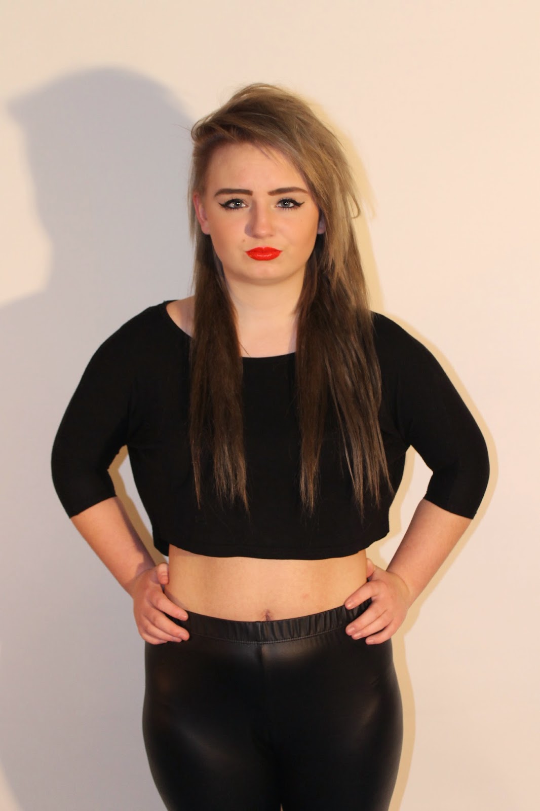
This image would work well for my magazine, because she is directly looking at the camera, which makes her engage with the audience. This picture is also a mid-shot image which would work well for the front image photo.

This picture would also work well for my magazine as the model is facing forward, directly addressing the audience. The model also has a very stern facial expression, which shows that she is in control; I feel my target audience would connect with this.

This image would well for my magazine; however it would not work well for the main cover picture as it isn't a mid-shot and she's not facing directly towards the audience, which means the audience wouldn't connect with her, and feel more drawn to buy the magazine. However this image would be good for contents page or double page spread because of how the model is looking up, supposing that she is thinking about or looking at something that intrigues her; this will make the audience wonder what this is and will want to read more to find out.

I feel this image would also work well for my magazine, as her style of clothing fit the genre (Indie/Rock) and the attitude the model is putting across, is rather dominate and in control of the situation. Also the red lipstick stands out more in this image, and represents either love or danger; the reader will want to know what her story is from looking at this image.

I like this image, because of the models pose and body position in this image; I feel this image would work well with the contents page or double page spread. I like how the model is looking up, with a slit pout on her lip; I feel because this image is taken from the side all of the models features are clear and body is more defined.

This image comes across a lot more innocent than the other images, showing more of her sweet and innocent side. I feel this image would work well for the double page spread as when the audience are reading all about her they would understand the image more and see that she truly does have a more innocent side, that she doesn't put across. I also like the lighting in this image, as its bright and shows all her features; the lighting being so bright also helps present her more innocent side.
Subscribe to:
Posts (Atom)